About CAEG
Capricornia Access and Equity Group provides advocacy for people who identify as having a disability, which within Livingstone is higher than the average at 24%. We work with the community to identify access and equity issues in public spaces and strategise solutions to implement removing those barriers.
Our goal is to position our area as an inclusive community where quality of life and supporting people with a disability to have meaning and purpose is recognised and delivered on. Along with reaching out to venue owners, council and businesses to support rectifying access issues we support events creation to build community inclusion.
We Believe in A Collaborative Approach
What We Do
Discuss local issues
Share inclusive ideas
Work with Council, local businesses and the community to improve access.
Community Engagement
Addressing accessibility barriers and enhancing inclusion within our shire requires your help. If you’ve experienced a barrier contact us.
Identify & Solve
Identify and address issues around our shire to create a more accessible landscape. Fundamental for an inclusive community our goal is to make this happen. Issues register.
Meeting Dates 2025
Capricornia Access & Equity Group
We discuss local issues & meet when we have projects to deliver, people in the community to catch up with & when we need to advocate for those who can’t.
Macca’s Accessibility BBQs
Enhancing inclusion within our shire, Macca’s holds a BBQ at Lagoon BBQ’s at different times of the year. Info when these happen follow the CAEG Facebook page.
Accessibility Capricornia
This Livingstone Shire Council reference group meets six times a year at The Hub. First Thursday every second month, with Councillors and council workers.


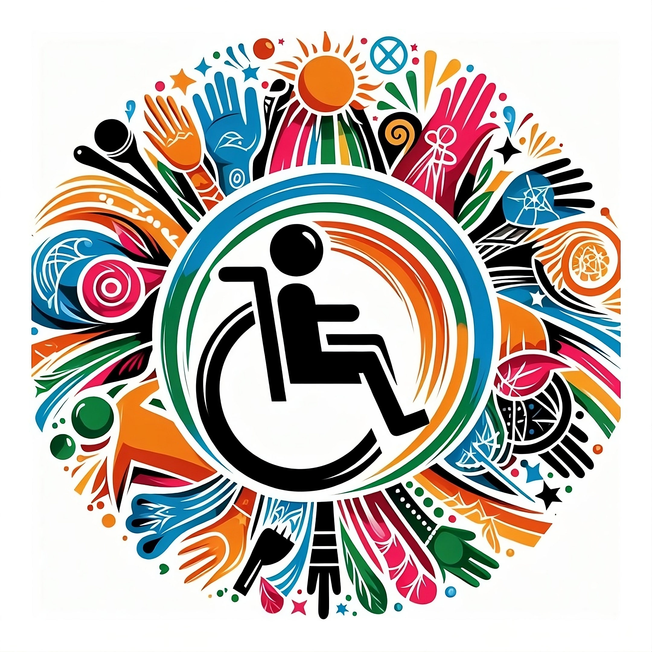
CAEG Logo
- Seaside Waves, Coral: The wave-like depictions symbolise the coastal town of Livingstone, connecting our coral reef and ocean as a unique identifier of the geographical location of our community on the Southern Great Barrier Reef. The colours of shapes are depicting the colours of coral while also signalling diversity. The sun represents hope and brightness, while paying homage to the sunny tropical nature of our climate.
- Wheelchair Icon and Walking Stick: The wheelchair icon represents disability, while the walking stick represents the aged population. Both are essential elements in advocating for equity in accessibility.
- Hands & People: The colourful hands continue to represent that we all need to reach out across the divides within the community. They people signal that this whole thing is actually about people!
- Round shape: It’s a closing of the loop, suggesting that together we can bring wholistic solutions that serve the whole community. Harmonious and limitless, as there is absent of harsh barriers.
- “TUIT” written on the back of the printed version of logo / business card: People will often say “I will do it when a get around to it”. So, when given a print version, they will finally have “A Round TUIT” so they have no excuse now for inaction!
Quick Links
Projects
Accessible Toilet Initiative
Accessible Venues
Local Accommodation
Access Maps
